W3.CSS Tables
Displaying a Table
First Name
Last Name
Points
Jill
Smith
50
Eve
Jackson
94
Adam
Johnson
67
Example
<table class="table">
Try It Yourself »
Displaying a Striped Table
First Name
Last Name
Points
Jill
Smith
50
Eve
Jackson
94
Adam
Johnson
67
Displaying a Bordered Striped Table
First Name
Last Name
Points
Jill
Smith
50
Eve
Jackson
94
Adam
Johnson
67
Displaying a Table with a Border
First Name
Last Name
Points
Jill
Smith
50
Eve
Jackson
94
Adam
Johnson
67
Flipping the Stripes
First Name
Last Name
Points
Jill
Smith
50
Eve
Jackson
94
Adam
Johnson
67
To flip the stripes, just add <thead> around the table header:
Example
<thead>
Try It Yourself »
Displaying a Hoverable Table
First Name
Last Name
Points
Jill
Smith
50
Eve
Jackson
94
Adam
Johnson
67
Displaying a Table with a Colored Heading
First Name
Last Name
Points
Jill
Smith
50
Eve
Jackson
94
Adam
Johnson
67
Example
<thead>
Try It Yourself »
Displaying a Table as a Card
First Name
Last Name
Points
Jill
Smith
50
Eve
Jackson
94
Adam
Johnson
67
Displaying a Responsive Table
A responsive table will display a horizontal scroll bar if the screen is too
small to display the full content.
Try to resize the screen to see the effect.
First Name
Last Name
Points
Points
Points
Points
Points
Points
Points
Points
Points
Points
Points
Points
Points
Jill
Smith
5000
5000
5000
5000
5000
5000
5000
5000
5000
5000
5000
5000
5000
Eve
Jackson
9400
9400
9400
9400
9400
9400
9400
9400
9400
9400
9400
9400
9400
Adam
Johnson
6700
6700
6700
6700
6700
6700
6700
6700
6700
6700
6700
6700
6700
Example
<div class="responsive">
Try It Yourself »
Displaying a Tiny Table
First Name
Last Name
Points
Jill
Smith
50
Eve
Jackson
94
Adam
Johnson
67
Displaying a Small Table
First Name
Last Name
Points
Jill
Smith
50
Eve
Jackson
94
Adam
Johnson
67
Displaying a Large Table
First Name
Last Name
Points
Jill
Smith
50
Eve
Jackson
94
Adam
Johnson
67
Displaying an xLarge Table
First Name
Last Name
Points
Jill
Smith
50
Eve
Jackson
94
Adam
Johnson
67
Displaying an xxLarge Table
Name
Points
Jill Smith
50
Eve Jackson
94
Adam Johnson
67
Bo Nilson
35
Displaying a Red xxLarge Table
Name
Points
Jill Smith
50
Eve Jackson
94
Adam Johnson
67
Bo Nilson
35
Displaying an xxxLarge Table
Name
Points
Smith
50
Jackson
94
Johnson
67
Nilson
35
Displaying a Jumbo Table
Name
Points
Smith
50
Jackson
94
Johnson
67
Nilson
35
W3.CSS Lists
Displaying a List
Example
<ul class="ul">
Try It Yourself »
Displaying a List with a Border
Example
<ul class="ul border">
Try It Yourself »
Displaying a List as a Card
Example
<ul class="ul card-4">
Try It Yourself »
Displaying a Tiny List
Example
<ul class="ul tiny">
Try It Yourself »
Displaying a Small List
Example
<ul class="ul
small">
Try It Yourself »
Displaying a Large List
Example
<ul class="ul large">
Try It Yourself »
Displaying a xLarge List
Example
<ul class="ul xlarge">
Try It Yourself »
Displaying a xxLarge List
Example
<ul class="ul xxlarge">
Try It Yourself »
Displaying a Red List
Example
<ul class="ul xxlarge red">
Try It Yourself »
Displaying a xxxLarge List
Example
<ul class="ul xxxlarge">
Try It Yourself »
Displaying a Jumbo List
Example
<ul class="ul jumbo">
W3.CSS Images
Displaying an Image
Example
<div class="image">
Try It Yourself »
Displaying an Image in a Circle
Example
<img src="images/audi8.png" class="circle" alt="Car"
style="width:70%">
Try It Yourself »
Displaying an Image Text
Gorgeous Car
Example
<div class="image">
Try It Yourself »
Displaying an Image as a Card
Example
<div class="card-4" style="width:70%">
Try It Yourself »
Constructing a Photo Album
Summer 2015
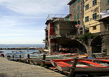
5 Terre
Monterosso
Vernazza
Manarola
Corniglia
Riomaggiore
Example
<div class="third">
Try It Yourself »
W3.CSS Signs and Tags
Displaying a Sign
London Zoo
Displaying Signs in a Row
S
A
L
E
Example
<div class="sign red">S</div>
Try It Yourself »
Displaying Tags
News Section New!
Comments More Later!
Example
<p>News Section <span class="tag yellow">New!</span></
p>
Try It Yourself »
Displaying Badges
Tokyo 6
London 8
Example
<p>Tokyo <span class="badge red">6</span></p>
Try It Yourself »
Displaying Road Signs
Example
<div class="sign round green" style="padding:3px 3px">
Try It Yourself »
Displaying Large Tags
66
Example
<span class="tag jumbo padding-large blue">66</span>
Try It Yourself »
Displaying Large Badges
66
Example
<p><span class="badge jumbo padding-large red">66</span></
p>
Try It Yourself »
Displaying Large Signs
IN
CASE OF
Example
<span class="sign xxlarge padding orange center">
Try It Yourself »
49,99
Example
<div class="sign jumbo green">
Try It Yourself »
Displaying Rounded Signs
DO NOT brEATHE
Example
<span class="sign xxlarge padding round-large red center">
Try It Yourself »
Displaying Letters as Signs
J
A
N
U
A
R
Y
Example
<span class="sign
black">J</span>
Try It Yourself »
W3.CSS Icons
Icon Libraries
With W3.CSS you may use icon libraries such as:
Font Awesome Icons
Google Material Icons
Bootstrap Icons
Unfortunately we do not have access to the actual icon libraries, which are
linked to online. Therefore we will just discuss the theoretical application of
them.
Using Icons
To use an icon, just add the name of the icon to the class of an HTML
<i> element.
To control the size of the icon, change the font-size property of the icon,
or use the classes:
w3-tiny
w3-small
w3-large
w3-xxlarge
w3-xxxlarge
The example below describes how to link to and use the the font-awesome
library.
Example
<!DOCTYPE html><link rel="stylesheet"
href="http://cdnjs.cloudflare.com/ajax/libs/font-awesome/
4.4.0/css/font-awesome.min.css">
W3.CSS Navigation
Top navigation
Home
Link1
Link2
Link3
Link4
Home
Link 1
Link 2
Link 3
Link 4
Home
Link 1
Link 2
Link 3
Link 4
Example
<nav class="w3-topnav w3-green">
Try It Yourself »
Example with Font Awesome
<nav class="w3-topnav w3-green">
Try It Yourself »
Example with Material Icons
<nav class="w3-topnav w3-green">
Try It Yourself »
Side navigation
With side navigation, you have several options:
Always display the navigation pane to the left of the page content.
Open the navigation pane, hiding the left part of the page content.
Open the navigation pane, hiding all of the page content.
Shift the page content to the right, when opening the navigation
pane.
Example: Always Display the navigation Pane
<nav class="w3-sidenav w3-white w3-card-2" style="width:25%">
Try It Yourself »
Open the navigation Pane Hiding a Part of the Content
function w3_open() {
Try It Yourself »
Open the navigation Pane Hiding All of the Content
function w3_open()
{
Try It Yourself »
Shift the Content to the Right
function w3_open() {
Try It Yourself »
Top navigation as Page Tabulators
Example
<div class="w3-topnav red">
Try It Yourself »
Side navigation as Page Tabulators
Example
<nav class="w3-sidenav yellow" style="width:25%">
Try It Yourself »
W3.CSS Dropdowns
Dropdown Hover
The dropdown-hover class defines an hoverable dropdown
element.
The dropdown-content class defines a dropdown part to be
displayed.
Example
<div class="w3-dropdown-hover">
Try It Yourself »
Both the hoverable element part and the dropdown element can be any HTML
element.
In the previous example the hoverable part was a <button>, and the
dropdown part a <div>.
In the next example the hoverable part is a <p>, and the dropdown part
is a <span>.
Example
<div class="w3-dropdown-hover">
Try It Yourself »
A Menu Dropdown
The dropdown-hover class is perfect for dropdown menus.
Move the mouse over "Link A":
Example
<div class="w3-dropdown-hover">
Try It Yourself »
A Clickable Dropdown
The dropdown-click class is similar to dropdown-hover,
except that the dropdown is opened by JavaScript.
Example
<div
class="dropdown-click">
Try It Yourself »