Forms are a simple way that a person viewing your Web page can send you data. This is done by the user filling in various parts or input lines within the form designated by you.
As you will see, designing forms can be quite an undertaking on the Web. They introduce a kind of interactivity that you can’t get from other kinds of media like television or magazines. Forms, and the capabilities they provide to enable two-way communication between the website creator and the website visitor, are what makes the Web a truly unique publishing platform.
Forms are supported by almost every browser and make it possible to create documents that collect and process user input and formulate personalized replies. Once a user fills out a form, it is submitted to a server or e-mailed to a specific address. If sent to a server, that server passes that information to a supporting program or application that processes the data.
Designing and styling forms and getting constant results across browsers and platforms can be the most difficult part of web development.
Most of this difficulty arises because of the nature of form elements. They’re built to solicit input from the user of the site, and how that input gets there can be quite different from device to device.
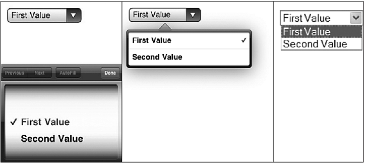
Different operating systems have different native form control behavior and appearance, and browser vendors have tried to keep the display of interface elements in line with those standards. As a result, a user will typically see familiar inputs even if they use multiple browsers on one device, but if they change devices or operating systems, the interface elements will change. Even in the same browser, the appearances may differ between Windows, Mac OS X, Linux, and mobile devices. Below is an example that shows the difference in appearance of a select element on three different devices.
Something else that can be unique to form layouts is the need to juggle the myriad of positioning and placement and states of the elements of the form. Large fields, small fields, sets of fields, labels, and help or error messages all need to be placed so that it is clear to the visitor what is being requested from them. The grid that works for a standard-length text input along with its label may not work for a collection of radio buttons or a combination of inputs such as parts of a phone number or city and state.
A form consists of two main components. First, one or more input fields into which the visitor types or clicks the information you have requested. Second, a "submit" button which, when clicked, sends the contents of the form to a server-side program for processing in whatever way it wishes.
Filling out forms online is a great way to glean information from your visitors or provide enhanced service to them. Although the scripts that actually receive and process such form data are beyond the scope of these lessons, the next issue is how some of the various form elements work in HTML markup. The first thing you’ll need in any form you create is the form element:
Although form elements accept many attributes, only one, the action attribute, is required. The action attribute is similar to the href attribute in the <a> element. It specifies a particular URL where the script that processes the form data can be found.
A form element is a lot like a <blockquote> in the sense that it can have only certain child elements. For simple forms, you can use the <p> or <div> elements that you’ve already seen used before, and you can place all the form’s controls into these elements. However, there are more complex forms that you may encounter that will require a HTML element specifically designed to group form controls into groups: the <fieldset> element.
This chapter describes all HTML form elements.
the most important form element is the <input> element.
the <input> element can vary in many ways, depending on the type attribute.
 |
All HTML input types are covered in the next chapter. |
|---|
the <select> element defines a drop-down list:
the <option> elements defines the options to select.
the list will normally show the first item as selected.
You can add a selected attribute to define a predefined option.
the <textarea> element defines a multi-line input field (a text area):
this is how the HTML code above will be displayed in a browser:
the <button> element defines a clickable button:
this is how the HTML code above will be displayed in a browser:
HTML5 added the following form elements:
 |
By default, browsers do not display unknown elements. New elements will not destroy your page. |
|---|
the <datalist> element specifies a list of pre-defined options for an <input> element.
Users will see a drop-down list of pre-defined options as they input data.
the list attribute of the <input> element, must refer to theid attribute of the <datalist> element.
An <input> element with pre-defined values in a <datalist>:
the purpose of the <keygen> element is to provide a secure way to authenticate users.
the <keygen> element specifies a key-pair generator field in a form.
When the form is submitted, two keys are generated, one private and one public.
the private key is stored locally, and the public key is sent to the server.
the public key could be used to generate a client certificate to authenticate the user in the future.
A form with a keygen field:
the <output> element represents the result of a calculation (like one performed by a script).
Perform a calculation and show the result in an <output> element:
= new in HTML5.
| Tag | Description |
|---|---|
| <form> | Defines an HTML form for user input |
| <input> | Defines an input control |
| <textarea> | Defines a multiline input control (text area) |
| <label> | Defines a label for an <input> element |
| <fieldset> | Groups related elements in a form |
| <legend> | Defines a caption for a <fieldset> element |
| <select> | Defines a drop-down list |
| <optgroup> | Defines a group of related options in a drop-down list |
| <option> | Defines an option in a drop-down list |
| <button> | Defines a clickable button |
| <datalist> | Specifies a list of pre-defined options for input controls |
| <keygen> | Defines a key-pair generator field (for forms) |
| <output> | Defines the result of a calculation |
this chapter describes the input types of the <input> element.
<input type="text"> defines a one-line input field for text input:
this is how the HTML code above will be displayed in a browser:
First name:<input type="password"> defines a password field:
this is how the HTML code above will be displayed in a browser:
User name:
|
the characters in a password field are masked (shown as asterisks or circles). |
|---|
<input type="submit"> defines a button for submitting form input to a form-handler.
the form-handler is typically a server page with a script for processing input data.
the form-handler is specified in the form's action attribute:
This is how the HTML code above will be displayed in a browser:
If you omit the submit button's value attribute, the button will get a
default text:
<input type="radio"> defines a radio button.
Radio buttons let a user select ONLY ONE of a limited number of choices:
this is how the HTML code above will be displayed in a browser:
Male<input type="checkbox"> defines a checkbox.
Checkboxes let a user select ZERO or MORE options of a limited number of choices.
this is how the HTML code above will be displayed in a browser:
I have a bike<input type="button"> defines a button:
this is how the HTML code above will be displayed in a browser:
HTML5 added several new input types:
|
Input types, not supported by old web browsers, will behave as input type text. |
|---|
the <input type="number"> is used for input fields that should contain a numeric value.
You can set restrictions on the numbers.
Depending on browser support, the restrictions can apply to the input field.
Here is a list of some common input restrictions (some are new in HTML5):
| Attribute | Description |
|---|---|
| disabled | Specifies that an input field should be disabled |
 max max |
Specifies the maximum value for an input field |
| maxlength | Specifies the maximum number of character for an input field |
|
min |
Specifies the minimum value for an input field |
|
pattern |
Specifies a regular expression to check the input value against |
| readonly | Specifies that an input field is read only (cannot be changed) |
|
required |
Specifies that an input field is required (must be filled out) |
| size | Specifies the width (in characters) of an input field |
|
step |
Specifies the legal number intervals for an input field |
| value | Specifies the default value for an input field |
You will learn more about input restrictions in the next chapter.
the <input type="date"> is used for input fields that should contain a date.
Depending on browser support, a date picker can show up in the input field.
You can add restrictions to the input:
the <input type="color"> is used for input fields that should contain a color.
Depending on browser support, a color picker can show up in the input field.
the <input type="range">is used for input fields that should contain a value within a range.
Depending on browser support, the input field can be displayed as a slider control.
You can use the following attributes to specify restrictions: min, max, step, value.
the <input type="month"> allows the user to select a month and year.
Depending on browser support, a date picker can show up in the input field.
the <input type="week"> allows the user to select a week and year.
Depending on browser support, a date picker can show up in the input field.
the <input type="time"> allows the user to select a time (no time zone).
Depending on browser support, a time picker can show up in the input field.
the <input type="datetime"> allows the user to select a date and time (with time zone).
|
the input type datetime is removed from the HTML standard. Use datetime-local instead. |
|---|
the <input type="datetime-local"> allows the user to select a date and time (no time zone).
Depending on browser support, a date picker can show up in the input field.
the <input type="email"> is used for input fields that should contain an e-mail address.
Depending on browser support, the e-mail address can be automatically validated when submitted.
Some smartphones recognize the email type, and adds ".com" to the keyboard to match email input.
the <input type="search"> is used for search fields (a search field behaves like a regular text field).
the <input type="tel"> is used for input fields that should contain a telephone number.
the tel type is currently supported only in Safari 8.
the <input type="url"> is used for input fields that should contain a URL address.
Depending on browser support, the url field can be automatically validated when submitted.
Some smartphones recognize the url type, and adds ".com" to the keyboard to match url input.
the value attribute specifies the initial value for an input field:
the readonly attribute specifies that the input field is read only (cannot be changed):
the readonly attribute does not need a value. It is the same as writing readonly="readonly".
the disabled attribute specifies that the input field is disabled.
A disabled element is un-usable and un-clickable.
Disabled elements will not be submitted.
the disabled attribute does not need a value. It is the same as writing disabled="disabled".
the size attribute specifies the size (in characters) for the input field:
the maxlength attribute specifies the maximum allowed length for the input field:
With a maxlength attribute, the input control will not accept more than the allowed number of characters.
the attribute does not provide any feedback. If you want to alert the user, you must write JavaScript code.
|
Input restrictions are not foolproof. JavaScript provides many ways to
add illegal input. To safely restrict input, restrictions must be checked by the receiver (the server) as well. |
|---|
HTML5 added the following attributes for <input>:
and the following attributes for <form>:
the autocomplete attribute specifies whether a form or input field should have autocomplete on or off.
When autocomplete is on, the browser automatically complete values based on values that the user has entered before.
Tip: It is possible to have autocomplete "on" for the form, and "off" for specific input fields, or vice versa.
the autocomplete attribute works with <form> and the following <input> types: text, search, url, tel, email, password, datepickers, range, and color.
An HTML form with autocomplete on (and off for one input field):
Tip: In some browsers you may need to activate the autocomplete function for this to work.
the novalidate attribute is a <form> attribute.
When present, novalidate specifies that form data should not be validated when submitted.
Indicates that the form is not to be validated on submit:
the autofocus attribute is a boolean attribute.
When present, it specifies that an <input> element should automatically get focus when the page loads.
Let the "First name" input field automatically get focus when the page loads:
the form attribute specifies one or more forms an <input> element belongs to.
Tip: To refer to more than one form, use a space-separated list of form ids.
An input field located outside the HTML form (but still a part of the form):
the formaction attribute specifies the URL of a file that will process the input control when the form is submitted.
the formaction attribute overrides the action attribute of the <form> element.
the formaction attribute is used with type="submit" and type="image".
An HTML form with two submit buttons, with different actions:
the formenctype attribute specifies how the form-data should be encoded when submitting it to the server (only for forms with method="post").
the formenctype attribute overrides the enctype attribute of the <form> element.
the formenctype attribute is used with type="submit" and type="image".
Send form-data that is default encoded (the first submit button), and encoded as "multipart/form-data" (the second submit button):
the formmethod attribute defines the HTTP method for sending form-data to the action URL.
the formmethod attribute overrides the method attribute of the <form> element.
the formmethod attribute can be used with type="submit" and type="image".
the second submit button overrides the HTTP method of the form:
the novalidate attribute is a boolean attribute.
When present, it specifies that the <input> element should not be validated when submitted.
the formnovalidate attribute overrides the novalidate attribute of the <form> element.
the formnovalidate attribute can be used with type="submit".
A form with two submit buttons (with and without validation):
the formtarget attribute specifies a name or a keyword that indicates where to display the response that is received after submitting the form.
the formtarget attribute overrides the target attribute of the <form> element.
the formtarget attribute can be used with type="submit" and type="image".
A form with two submit buttons, with different target windows:
the height and width attributes specify the height and width of an <input> element.
the height and width attributes are only used with <input type="image">.
|
Always specify the size of images. If the browser does not know the size, the page will flicker while images load. |
|---|
Define an image as the submit button, with height and width attributes:
the list attribute refers to a <datalist> element that contains pre-defined options for an <input> element.
An <input> element with pre-defined values in a <datalist>:
the min and max attributes specify the minimum and maximum value for an <input> element.
the min and max attributes work with the following input types: number, range, date, datetime, datetime-local, month, time and week.
<input> elements with min and max values:
the multiple attribute is a boolean attribute.
When present, it specifies that the user is allowed to enter more than one value in the <input> element.
the multiple attribute works with the following input types: email, and file.
A file upload field that accepts multiple values:
the pattern attribute specifies a regular expression that the <input> element's value is checked against.
the pattern attribute works with the following input types: text, search, url, tel, email, and password.
Tip: Use the global title attribute to describe the pattern to help the user.
Tip: Learn more about regular expressions in our JavaScript tutorial.
An input field that can contain only three letters (no numbers or special characters):
the placeholder attribute specifies a hint that describes the expected value of an input field (a sample value or a short description of the format).
the hint is displayed in the input field before the user enters a value.
the placeholder attribute works with the following input types: text, search, url, tel, email, and password.
An input field with a placeholder text:
the required attribute is a boolean attribute.
When present, it specifies that an input field must be filled out before submitting the form.
the required attribute works with the following input types: text, search, url, tel, email, password, date pickers, number, checkbox, radio, and file.
A required input field:
the step attribute specifies the legal number intervals for an <input> element.
Example: if step="3", legal numbers could be -3, 0, 3, 6, etc.
Tip: the step attribute can be used together with the max and min attributes to create a range of legal values.
the step attribute works with the following input types: number, range, date, datetime, datetime-local, month, time and week.
An input field with a specified legal number intervals: