The following is an excerpt from Tim Berners-Lee’s (you do remember who he is don't you?) article in a 2010 issue of Scientific American magazine, "Long Live the Web: A Call for Continued Open Standards and Neutrality:"
The primary design principle underlying the Web’s usefulness and growth is universality. When you make a link, you can link to anything. That means people must be able to put anything on the Web, no matter what computer they have, software they use or human language they speak and regardless of whether they have a wired or wireless Internet connection. The Web should be usable by people with disabilities. It must work with any form of information, be it a document or a point of data, and information of any quality—from a silly tweet to a scholarly paper. And it should be accessible from any kind of hardware that can connect to the Internet: stationary or mobile, small screen or large ...
Over the time, the argument has been over the accessibility of content on websites that were originally designed for desktops and were inflexible to other devices causing substandard browsing experiences. The intermediate fix was to serve up the same content at different URLs to different devices (often segregated within a subdomain like m. or mobile., which was often viewed as a disciminatory practice. There is a large movement that believes in the concept of "one web", essentially meaning that all websites should be designed for equal access across all platforms in terms of content. Not serving up a stripped down version of a site minus all of the bells and whistles because it is being accessed with a iPhone versus a desktop. It is widely believed that the creation of a separate mobile website is simply a cop-out.
Now in the age where mobile users are eclipsing the number of desktop users in many segments of the web, it is the realization that web design needs to accommodate the shift and begin the practice of designing from the content out. Meaning that instead of designing a site for a particular viewport size (desktop) and then adjusting the content for downsizing to multiple smaller viewports. It should be based on the flexibility of the content across all viewport sizes from the beginning instead of an afterthought.
Traditionally, the min-width and max-width properties were used to build flexible layout grids as well as setting limits on flexible layouts. Now you may utilize another set of techniques to make adaptive layouts that find a compromise between the best presentation and readability of the content and the visitor’s browser dimensions.
What if you could adapt the layout from the standard two-column layout into a one-column layout for narrower browsers or bring the footer up into a third column for the insanely wide screens? Or what if you could adjust the size of header type or swap background images so the design feels more proportional to the “page” as presented, while body copy remains at a standard, readable size?
This adaptation of presentation has been dubbed "Responsive Web Design". It takes the standard mechanics of flexible grids, relative sizing of fonts, and other content elements and uses media queries to change the positioning of content, the sizing of elements, or the overall layout grid to respond to the viewport the device is giving you to work with.
Media queries are currently supported in Safari 3+, Firefox 3.5+, Opera 7+, Internet Explorer 9+, mobile WebKit, and Opera Mobile. Therefore, there is wide support for them, except for the aging IE 6 through IE 8’s chunk of the desktop market.
It isn’t so bad, though, because the support (or lack thereof) can be taken into consideration as just another device criteria in many instances. For mobile development, handheld device types are generally placed into two or three buckets already, first specifying the most common device types (ie. laptops, tablets, smartphones) and then breaking devices down by screen size or orientation.
Responsive Web Design creates web pages that fluidily adjust to all sizes of viewports (screen sizes) without leaving out or creating specific content for mobile devices. In most cases it uses only CSS and HTML without the use of special programs or applications.
Web pages can be viewed using many different devices: desktops, tablets, and phones. Your web page should look good, and be easy to use, regardless of the device.
Web pages should not leave out information to fit smaller devices, but rather adapt its content to fit any device:


It is called responsive web design when you use CSS and HTML to resize, hide, shrink, enlarge, or move the content to make it look good on any size screen.
The viewport is the user's visible area of a web page. The viewport size can vary with the device, and will be smaller on a mobile phone than on a computer screen.
Before tablets and mobile phones, web pages were designed only for computer screens, and it was common for web pages to have a static design and a fixed size.
Then, when we started surfing the internet using tablets and mobile phones, fixed size web pages were too large to fit the viewport. To fix this, browsers on those devices scaled down the entire web page to fit the screen or entirely seperate pages were created for the smaller viewports.
This was not perfect, but a quick fix.
HTML5 introduced a method to let web designers take control over the
viewport, through the <meta> tag.
You should include the following <meta> tag in all your
web pages:
The width=device-width part sets the width of the page to follow
the screen-width of the device (which will vary depending on the device).
The initial-scale=1.0 part sets the initial zoom level when the
page is first loaded by the
browser.
Here is an example of a web page without the viewport meta tag, and the same web page with the viewport meta tag:
If you are browsing this page with a phone or a tablet, you can click on the two links to see the difference.
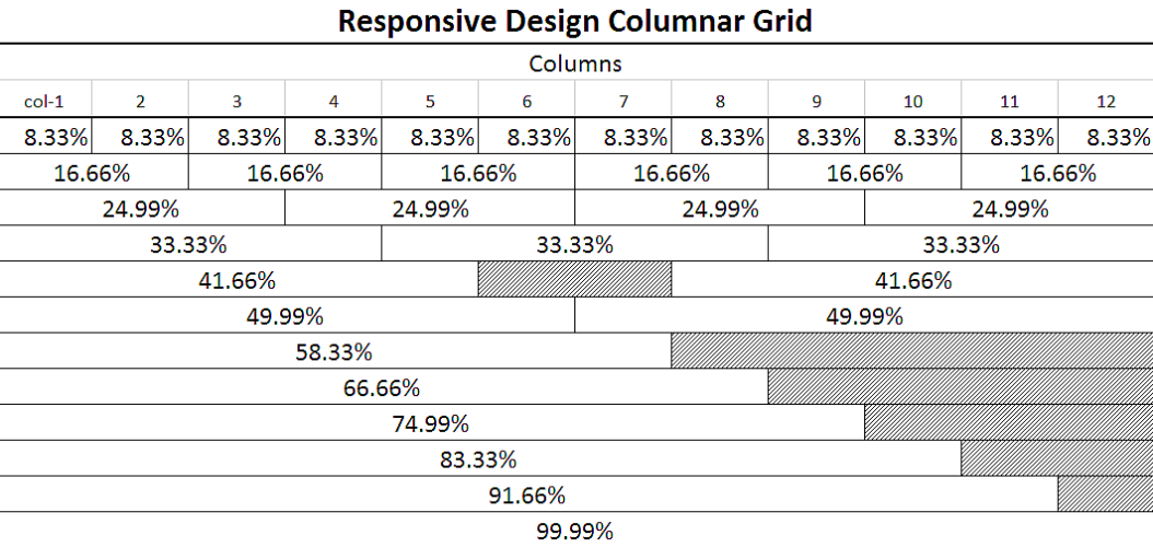
Many web pages are based on a grid-view, which means that the page is divided into columns:
Using a grid-view is very helpful when designing web pages. It makes it easier to place elements on the page.
A responsive grid-view often has 12 columns, and has a total width of 100%, and will shrink and expand as you resize the browser window.
Let's start building a responsive grid-view.
First ensure that all HTML elements have the box-sizing property
set to border-box. This makes sure that the padding and border are
included in the total width and height of the elements.
Review the following code. To use it in the Try-it Editor make sure you utilize a style block:
The following example shows a simple responsive web page, with two columns:
The example above is fine if the web page only contains two columns. However, we want to use a responsive grid-view with 12 columns, to have more control over the web page.
So first we must calculate the percentage for one column: 100% / 12 columns =
8.33%. Then we make one class for each of the 12 columns,
class="col-" and a number defining how many columns the section
should span:
All these columns should be floating to the left, and have a padding of 15px:
The columns inside a row are all floating to the left, and are therefore taken out of the flow of the page, and other elements will be placed as if the columns does not exist. To prevent this, we will add a style that clears the flow:
We also want to add some styles and colors to make it look better:
Each row should be wrapped in a <div>. The number of
columns inside a row should allways add up to 12:
Use all of the above examples combined to formulate your example. Make sure that you add some content so that the CSS has something to act upon.
NOTE: The webpage in the example does not look good when you resize the browser window to a very small width. In the next chapter you will learn how to fix that.
Media query is a CSS technique introduced in CSS3.
It uses the @media rule to include a block of CSS properties
only if a certain condition is true.
If the browser window is smaller than 500px, the background color will change to lightblue:
Earlier in this tutorial we made a web page with rows and columns, and it was responsive, but it did not look good on a small screen.
Media queries can help with that. We can add a breakpoint where certain parts of the design will behave differently on each side of the breakpoint.
Use a media query to add a breakpoint at 768px:
When the screen (browser window) gets smaller than 768px, each column should have a width of 100%:
Mobile First means designing for mobile before designing for desktop or any other device (This will make the page display faster on smaller devices).
This means that we must make some changes in our CSS.
Instead of changing styles when the width gets smaller than 768px, we should change the design when the width gets larger than 768px. will make our design Mobile First:
You can add as many breakpoints as you like.
We will also insert a breakpoint between tablets and mobile phones.
We do this by adding one more media query (at 600px), and a set of new classes for devices larger than 600px (but smaller than 768px):
Note that the two sets of classes are almost identical, the only difference is the name (col- and col-m-):
It might seem odd that we have two sets of identical classes, but it gives us the opportunity in HTML, to decide what will happen with the columns at each breakpoint:
For desktop:
The first and the third section will both span 3 columns each. The middle section will span 6 columns.
For tablets:
The first section will span 3 columns, the second will span 9, and the third section will be displayed below the first two sections, and it will span 12 columns:
Media queries can also be used to change layout of a page depending on the orientation of the browser.
You can have a set of CSS properties that will only apply when the browser window is wider than its height, a so called "Landscape" orientation:
The web page will have a lighblue background if the orientation is in landscape mode:
If the width property is set to 100%, the image will be
responsive and scale up and down:
Notice that in the example above, the image can be scaled up to be larger
than its original size. A better solution, in many cases, will be to use the
max-width property instead.
If the max-width property is set to 100%, the image will scale
down if it has to, but never scale up to be larger than its original size:
Background images can also respond to resizing and scaling.
Here we will show three different methods:
1. If the background-size property is set to "contain", the
background image will scale, and try to fit the content area. However, the
image will keep its aspect ratio (the proportional relationship between the
image's width and height):
Here is the CSS code:
2. If the background-size property is set to "100% 100%", the
background image will stretch to cover the entire content area:
Here is the CSS code:
3. If the background-size property is set to "cover", the
background image will scale to cover the entire content area. Notice that the
"cover" value keeps the aspect ratio, and some part of the background image may
be clipped:
Here is the CSS code:
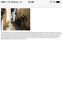
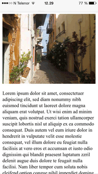
A large image can be perfect on a big computer screen, but useless on a small device. Why load a large image when you have to scale it down anyway? To reduce the load, or for any other reasons, you can use media queries to display different images on different devices.
Here is one large image and one smaller image that will be displayed on different devices:

You can use the media query min-device-width, instead of
min-width, which checks the device width, instead of the browser
width. Then the image will not change when you resize the browser window:
HTML5 introduced the <picture> element, which lets you
define more than one image.
| Element |
 |
 |
 |
 |

|
|---|---|---|---|---|---|
| <picture> | Not Supported | 38.0 | 38.0 | Not Supported | 25.0 |
The <picture> element works similar to the
<video> and <audio> elements. You set up
different sources, and the first source that fits the preferences is the one
being used:
The srcset attribute is required, and defines the source of the
image.
The media attribute is optional, and accepts the media queries
you find in CSS @media rule.
You should also define an <img> element for browsers that
do not support the<picture> element.
If the width property is set to 100%, the video player will be
responsive and scale up and down:
Notice that in the example above, the video player can be scaled up to be
larger than its original size. A better solution, in many cases, will be to use
themax-width property instead.
If the max-width property is set to 100%, the video player will
scale down if it has to, but never scale up to be larger than its original
size:
We want to add a video in our example web page. The video will be resized to always take up all the available space:
Frameworks are literally nothing more than templates that have all of the responsive design element predefined. All the user has to do is write the HTML and use the framework's predefined ID and class elements for the desired responses. There are many existing CSS Frameworks that offer Responsive Web Design functionality. Some consist of nothing more than stylesheets (W3.css) and others require a combination of a jquery script and stylesheet (Bootstrap). They are usually free, and fairly easy to use.
 |
NOTE: The majority of the examples in this section will involve working with W3.CSS. All of the example will require links to their respective stylesheets, eventhough you may be using them in the Try-it editor. In the case of W3 the relative link <link rel="stylesheet" href="images/w3.css"> will have to be included in the head of the examples you will create! Furthermore, it is advised that you also create actual HTML files out of some of these examples, especially the ones dealing directly with Responsive Design, since the Try-it editor cannot resize to show you the actual effect. |
|---|
A great way to create a responsive design is to use a responsive style sheet, like W3.CSS. W3.CSS makes it easy to develop sites that look nice at any size; desktop, laptop, tablet, or phone:
 A glimpse at "W3.CSS" W3 CSS related Material
 A glimpse at "Bootstrap"
Bootstrap was developed by Mark Otto and Jacob Thornton at Twitter, and released as an open source product in August 2011 on GitHub.
In June 2014 Bootstrap was the No.1 project on GitHub!
Advantages of Bootstrap:
There are two ways to start using Bootstrap on your own web site.
You can:
If you don't want to download and host Bootstrap yourself, you can include it from a CDN (Content Delivery Network).
MaxCDN provide CDN support for Bootstrap's CSS and JavaScript. Also include jQuery:
|
One advantage of using the Bootstrap CDN: Many users already have downloaded Bootstrap from MaxCDN when visiting another site. As a result, it will be loaded from cache when they visit your site, which leads to faster loading time. Also, most CDN's will make sure that once a user requests a file from it, it will be served from the server closest to them, which also leads to faster loading time. |
|---|
View an example of a Bootstrap CSS file.
NOTE: Look at the amount of detailed formatting that was done in this CSS to allow for use in almost any application of responsive design.Another popular framework is Skeleton, it uses only CSS to make responsive web pages.
 A glimpse at "Skeleton"
As you can see by the previous examples of the actual W3.css and Bootstrap.css, they are quite exhaustive with the number of elements available to create a responsive web design page that would meet just about every posible need.