
CSS3 gradients let you display smooth transitions between two or more specified colors.
Earlier, you had to use images for these effects. However, by using CSS3 gradients you can reduce download time and bandwidth usage. In addition, elements with gradients look better when zoomed, because the gradient is generated by the browser.
CSS3 defines two types of gradients:
The numbers in the table specify the first browser version that fully supports the property.
Numbers followed by -webkit-, -moz-, or -o- specify the first version that worked with a prefix.
| Property |
 |
 |
 |
 |
 |
|---|---|---|---|---|---|
| linear-gradient | 10.0 | 26.0 10.0 -webkit- |
16.0 3.6 -moz- |
6.1 5.1 -webkit- |
12.1 11.1 -o- |
| radial-gradient | 10.0 | 26.0 10.0 -webkit- |
16.0 3.6 -moz- |
6.1 5.1 -webkit- |
12.1 11.6 -o- |
| repeating-linear-gradient | 10.0 | 26.0 10.0 -webkit- |
16.0 3.6 -moz- |
6.1 5.1 -webkit- |
12.1 11.1 -o- |
| repeating-radial-gradient | 10.0 | 26.0 10.0 -webkit- |
16.0 3.6 -moz- |
6.1 5.1 -webkit- |
12.1 11.6 -o- |
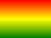
To create a linear gradient you must define at least two color stops. Color stops are the colors you want to render smooth transitions among. You can also set a starting point and a direction (or an angle) along with the gradient effect.
Example of linear Gradient:
NOTE: It goes without saying that throughout these excercises you have been reminded of using the proper element blocks and HTML for the working examples ("Try-It Editor"), primarily for designating the different elements such as the style block, the division id and the actual HTML. Make sure that you enclose the styling elements in a style block and for this example in particular you will have to denote the division ID (#grad) and then actually write some content in order for the background attribute to be invoked.
linear Gradient - Top to Bottom (this is default)
The following example shows a linear gradient that starts at the top. It starts red, transitioning to blue:
A linear gradient from top to bottom:
linear Gradient - Left to Right
The following example shows a linear gradient that starts from the left. It starts red, transitioning to blue:
A linear gradient from left to right:
linear Gradient - Diagonal
You can make a gradient diagonally by specifying both the horizontal and vertical starting positions.
The following example shows a linear gradient that starts at top left (and goes to bottom right). It starts red, transitioning to blue:
A linear gradient that starts at top left (and goes to bottom right):
If you want more control over the direction of the gradient, you can define an angle, instead of the predefined directions (to bottom, to top, to right, to left, to bottom right, etc.).
The angle is specified as an angle between a horizontal line and the gradient line, going counter-clockwise. In other words, 0deg creates a bottom to top gradient, while 90deg generates a left to right gradient.
The following example shows how to use angles on linear gradients:
A linear gradient with a specified angle:
The following example shows how to set multiple color stops:
A linear gradient from top to bottom with multiple color stops:
The following example shows how to create a linear gradient with the color of the rainbow and some text:
CSS3 gradients also support transparency, which can be used to create fading effects.
To add transparency, we use the rgba() function to define the color stops. The last parameter in the rgba() function can be a value from 0 to 1, and it defines the transparency of the color: 0 indicates full transparency, 1 indicates full color (no transparency).
The following example shows a linear gradient that starts from the left. It starts fully transparent, transitioning to full color red:
A linear gradient from left to right, with transparency:
The repeating-linear-gradient() function is used to repeat linear gradients:
A repeating linear gradient:
A radial gradient is defined by its center.
To create a radial gradient you must also define at least two color stops.
Example of Radial Gradient:
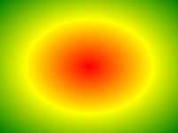
By default, shape is ellipse, size is farthest-corner, and position is center.
Radial Gradient - Evenly Spaced Color Stops (this is default)
A radial gradient with evenly spaced color stops:
Radial Gradient - Differently Spaced Color Stops
A radial gradient with differently spaced color stops:
The shape parameter defines the shape. It can take the value circle or ellipse. The default value is ellipse.
A radial gradient with the shape of a circle:
The size parameter defines the size of the gradient. It can take four values:
A radial gradient with different size keywords:
The repeating-radial-gradient() function is used to repeat radial gradients:
A repeating radial gradient:
With CSS3 you can create shadow effects!
With CSS3 you can add shadow to text and to elements.
In this chapter you will learn about the following properties:
text-shadowbox-shadowThe numbers in the table specify the first browser version that fully supports the property.
Numbers followed by -webkit- or -moz- specifies the first version that worked with a prefix.
| Property |
|
|
|
|
|
|---|---|---|---|---|---|
| text-shadow | 10.0 | 4.0 | 3.5 | 4.0 | 9.5 |
| box-shadow | 9.0 | 10.0 4.0 -webkit- |
4.0 3.5 -moz- |
5.1 3.1 -webkit- |
10.5 |
The CSS3 text-shadow property applies shadow to text.
In its simplest use, you only specify the horizontal shadow (2px) and the vertical shadow (2px):
Next, add a color to the shadow:
Then, add a blur effect to the shadow:
The following example shows a white text with black shadow:
The following example shows a red neon glow shadow:
To add more than one shadow to the text, you can add a comma-separated list of shadows.
The following example shows a red and blue neon glow shadow:
The following example shows a white text with black, blue, and darkblue shadow:
The CSS3 box-shadow property applies shadow to elements.
In its simplest use, you only specify the horizontal shadow and the vertical shadow:
Next, add a color to the shadow:
Next, add a blur effect to the shadow:
The following table lists the CSS3 shadow properties:
| Property | Description |
|---|---|
| box-shadow | Adds one or more shadows to an element |
| text-shadow | Adds one or more shadows to a text |
CSS3 contains several new text features.
In this chapter you will learn about the following text properties:
text-overflowword-wrapword-breakThe numbers in the table specify the first browser version that fully supports the property.
Numbers followed by -o- specify the first version that worked with a prefix.
| Property |
|
|
|
|
|
|---|---|---|---|---|---|
| text-overflow | 6.0 | 4.0 | 7.0 | 3.1 | 11.0 9.0 -o- |
| word-wrap | 5.5 | 23.0 | 3.5 | 6.1 | 12.1 |
| word-break | 5.5 | 4.0 | 15.0 | 3.1 | 15.0 |
The CSS3 text-overflow property specifies how overflowed content
that is not displayed should be signaled to the user.
It can be clipped:
this is some long text that will not fit in the box
or it can be rendered as an ellipsis (...):
this is some long text that will not fit in the box
The CSS code is as follows:
The following example shows how you can display the overflowed content when hovering over the element:
The CSS3 word-wrap property allows long words to be able to be
broken and wrap onto the next line.
If a word is too long to fit within an area, it expands outside:
this paragraph contains a very long word: thisisaveryveryveryveryveryverylongword. The long word will break and wrap to the next line.
The word-wrap property allows you to force the text to wrap, even if it means splitting it in the middle of a word:
this paragraph contains a very long word: thisisaveryveryveryveryveryverylongword. The long word will break and wrap to the next line.
The CSS code is as follows:
Allow long words to be able to be broken and wrap onto the next line:
The CSS3 word-break property specifies line breaking rules.
this paragraph contains some text. this line will-break-at- hyphens.
this paragraph contains some text. The lines will break at any character.
The CSS code is as follows:
The following table lists the new CSS3 text properties:
| Property | Description |
|---|---|
| text-align-last | Specifies how to align the last line of a text |
| text-emphasis | A shorthand for setting text-emphasis-style and text-emphasis-color in one declaration |
| text-justify | Specifies how justified text should be aligned and spaced |
| text-overflow | Specifies how overflowed content that is not displayed should be signaled to the user |
| word-break | Specifies line breaking rules for non-CJK scripts |
| word-wrap | Allows long words to be able to be broken and wrap onto the next line |

Web fonts allow Web designers to use fonts that are not installed on the user's computer.
When you have found/bought the font you wish to use, just include the font file on your web server, and it will be automatically downloaded to the user when needed.
Your "own" fonts are defined within the CSS3 @font-face
rule.
The numbers in the table specify the first browser version that fully supports the property.
| Property |
|
|
|
|
|
|---|---|---|---|---|---|
| @font-face | 9.0 | 4.0 | 3.5 | 3.2 | 10.0 |
trueType Fonts (TTF)
trueType is a font standard developed in the late 1980s, by Apple and Microsoft. TrueType is the most common font format for both the Mac OS and Microsoft Windows operating systems.
OpenType Fonts (OTF)
OpenType is a format for scalable computer fonts. It was built on trueType, and is a registered trademark of Microsoft. OpenType fonts are used commonly today on the major computer platforms.
the Web Open Font Format (WOFF)
WOFF is a font format for use in web pages. It was developed in 2009, and is now a W3C Recommendation. WOFF is essentially OpenType or trueType with compression and additional metadata. The goal is to support font distribution from a server to a client over a network with bandwidth constraints.
the Web Open Font Format (WOFF 2.0)
trueType/OpenType font that provides better compression than WOFF 1.0.
SVG Fonts/Shapes
SVG fonts allow SVG to be used as glyphs when displaying text. The SVG 1.1 specification define a font module that allows the creation of fonts within an SVG document. You can also apply CSS to SVG documents, and the @font-face rule can be applied to text in SVG documents.
Embedded OpenType Fonts (EOT)
EOT fonts are a compact form of OpenType fonts designed by Microsoft for use as embedded fonts on web pages.
The numbers in the table specifies the first browser version that fully supports the font format.
| Font format |
|
|
|
|
|
|---|---|---|---|---|---|
| TTF/OTF | 9.0* | 4.0 | 3.5 | 3.1 | 10.0 |
| WOFF | 9.0 | 5.0 | 3.6 | 5.1 | 11.1 |
| WOFF2 | Not Supported | 36.0 | 35.0* | Not Supported | 26.0 |
| SVG | Not Supported | 4.0 | Not Supported | 3.2 | 9.0 |
| EOT | 6.0 | Not Supported | Not Supported | Not Supported | Not Supported |
*IE: the font format only works when set to be "installable".
*Firefox: Not supported by default, but can be enabled (need to set a flag to "true" to use WOFF2).
In the CSS3 @font-face rule you must first define a name for the
font (e.g. myFirstFont), and then point to the font file.
 |
Tip: Always use lowercase letters for the font URL. Uppercase letters can give unexpected results in IE. |
|---|
To use the font for an HTML element, refer to the name of the font
(myFirstFont) through the font-family property:
You must add another @font-face rule containing descriptors for
bold text:
The file "sansation_bold.woff" is another font file, that contains the bold characters for the Sansation font.
browsers will use this whenever a piece of text with the font-family "myFirstFont" should render as bold.
this way you can have many @font-face rules for the same
font.
The following table lists all the font descriptors that can be defined inside
the @font-face
rule:
| Descriptor | Values | Description |
|---|---|---|
| font-family | name | Required. Defines a name for the font |
| src | URL | Required. Defines the URL of the font file |
| font-stretch | normal condensed ultra-condensed extra-condensed semi-condensed expanded semi-expanded extra-expanded ultra-expanded |
Optional. Defines how the font should be stretched. Default is "normal" |
| font-style | normal italic oblique |
Optional. Defines how the font should be styled. Default is "normal" |
| font-weight | normal bold 100 200 300 400 500 600 700 800 900 |
Optional. Defines the boldness of the font. Default is "normal" |
| unicode-range | unicode-range | Optional. Defines the range of UNIcode characters the font supports. Default is "U+0-10FFFF" |
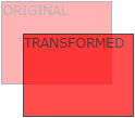
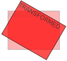
CSS3 transforms allow you to translate, rotate, scale, and skew elements.
A transformation is an effect that lets an element change shape, size and position.
CSS3 supports both 2D and 3D transformations.
Mouse over the elements below to see the action of a 2D transformation:
The numbers in the table specify the first browser version that fully supports the property.
Numbers followed by -ms-, -webkit-, -moz-, or -o- specify the first version that worked with a prefix.
| Property |
|
|
|
|
|
|---|---|---|---|---|---|
| transform | 10.0 9.0 -ms- |
36.0 4.0 -webkit- |
16.0 3.5 -moz- |
3.2 -webkit- | 23.0 15.0 -webkit- 12.1 10.5 -o- |
| transform-origin (two-value syntax) |
10.0 9.0 -ms- |
36.0 4.0 -webkit- |
16.0 3.5 -moz- |
3.2 -webkit- | 23.0 15.0 -webkit- 12.1 10.5 -o- |
In this chapter you will learn about the following 2D transformation methods:
translate()rotate()scale()skewX()skewY()matrix() |
Tip: You will learn about 3D transformations in the next chapter. |
|---|
The translate() method moves an element from its current
position (according to the parameters given for the X-axis and the Y-axis).
The following example moves the <div> element 50 pixels to the right, and 100 pixels down from its current position:
The rotate() method rotates an element clockwise or counter-
clockwise according to a given
degree.
The following example rotates the <div> element clockwise with 20 degrees:
Using negative values will rotate the element counter-clockwise.
The following example rotates the <div> element counter-clockwise with 20 degrees:
The scale() method increases or decreases the size of an element
(according to the parameters given for the width and height).
The following example increases the <div> element to be two times of its original width, and three times of its original height:
The following example decreases the <div> element to be half of its original width and height:
The skewX() method skews an element along the X-axis by the
given angle.
The following example skews the <div> element 20 degrees along the X-axis:
The skewY() method skews an element along the Y-axis by the
given angle.
The following example skews the <div> element 20 degrees along the Y-axis:
The skew() method skews an element along the X and Y-axis by
the given angles.
The following example skews the <div> element 20 degrees along the X-axis, and 10 degrees along the Y-axis:
If the second parameter is not specified, it has a zero value. So, the following example skews the <div> element 20 degrees along the X-axis:
The matrix() method combines all the 2D transform methods into
one.
The matrix() method take six parameters, containing mathematic functions, which allows you to rotate, scale, move (translate), and skew elements:
The following table lists all the 2D transform properties:
| Property | Description |
|---|---|
| transform | Applies a 2D or 3D transformation to an element |
| transform-origin | Allows you to change the position on transformed elements |
| Function | Description |
|---|---|
| matrix(n,n,n,n,n,n) | Defines a 2D transformation, using a matrix of six values |
| translate(x,y) | Defines a 2D translation, moving the element along the X- and the Y- axis |
| translateX(n) | Defines a 2D translation, moving the element along the X-axis |
| translateY(n) | Defines a 2D translation, moving the element along the Y-axis |
| scale(x,y) | Defines a 2D scale transformation, changing the elements width and height |
| scaleX(n) | Defines a 2D scale transformation, changing the element's width |
| scaleY(n) | Defines a 2D scale transformation, changing the element's height |
| rotate(angle) | Defines a 2D rotation, the angle is specified in the parameter |
| skew(x-angle,y-angle) | Defines a 2D skew transformation along the X- and the Y-axis |
| skewX(angle) | Defines a 2D skew transformation along the X-axis |
| skewY(angle) | Defines a 2D skew transformation along the Y-axis |
CSS3 allows you to format your elements using 3D transformations.
Mouse over the element below to see the difference in the transformation from the 2D transform:
The numbers in the table specify the first browser version that fully supports the property.
Numbers followed by -webkit-, -moz-, or -o- specify the first version that worked with a prefix.
| Property |
|
|
|
|
|
|---|---|---|---|---|---|
| transform | 10.0 | 36.0 12.0 -webkit- |
16.0 10.0 -moz- |
4.0 -webkit- | 23.0 15.0 -webkit- |
| transform-origin (three-value syntax) |
10.0 | 36.0 12.0 -webkit- |
16.0 10.0 -moz- |
4.0 -webkit- | 23.0 15.0 -webkit- |
| transform-style | 11.0 | 36.0 12.0 -webkit- |
16.0 10.0 -moz- |
4.0 -webkit- | 23.0 15.0 -webkit- |
| perspective | 10.0 | 36.0 12.0 -webkit- |
16.0 10.0 -moz- |
4.0 -webkit- | 23.0 15.0 -webkit- |
| perspective-origin | 10.0 | 36.0 12.0 -webkit- |
16.0 10.0 -moz- |
4.0 -webkit- | 23.0 15.0 -webkit- |
| backface-visibility | 10.0 | 36.0 12.0 -webkit- |
16.0 10.0 -moz- |
4.0 -webkit- | 23.0 15.0 -webkit- |
In this chapter you will learn about the following 3D transformation methods:
rotateX()rotateY()rotateZ()The rotateX() method rotates an element around its X-axis at a
given degree:
The rotateY() method rotates an element around its Y-axis at a
given degree:
The rotateZ() method rotates an element around its Z-axis at a
given degree:
The following table lists all the 3D transform properties:
| Property | Description |
|---|---|
| transform | Applies a 2D or 3D transformation to an element |
| transform-origin | Allows you to change the position on transformed elements |
| transform-style | Specifies how nested elements are rendered in 3D space |
| perspective | Specifies the perspective on how 3D elements are viewed |
| perspective-origin | Specifies the bottom position of 3D elements |
| backface-visibility | Defines whether or not an element should be visible when not facing the screen |
| Function | Description |
|---|---|
| matrix3d (n,n,n,n,n,n,n,n,n,n,n,n,n,n,n,n) |
Defines a 3D transformation, using a 4x4 matrix of 16 values |
| translate3d(x,y,z) | Defines a 3D translation |
| translateX(x) | Defines a 3D translation, using only the value for the X-axis |
| translateY(y) | Defines a 3D translation, using only the value for the Y-axis |
| translateZ(z) | Defines a 3D translation, using only the value for the Z-axis |
| scale3d(x,y,z) | Defines a 3D scale transformation |
| scaleX(x) | Defines a 3D scale transformation by giving a value for the X-axis |
| scaleY(y) | Defines a 3D scale transformation by giving a value for the Y-axis |
| scaleZ(z) | Defines a 3D scale transformation by giving a value for the Z-axis |
| rotate3d(x,y,z,angle) | Defines a 3D rotation |
| rotateX(angle) | Defines a 3D rotation along the X-axis |
| rotateY(angle) | Defines a 3D rotation along the Y-axis |
| rotateZ(angle) | Defines a 3D rotation along the Z-axis |
| perspective(n) | Defines a perspective view for a 3D transformed element |